The client had the idea of an app to help people find workout partners based on several factors such as gym location, fitness level and intended results. This need within the market is currently fulfilled by a few apps, however none have had particularly great uptake by users due to bad user experience of expensive payment models. The client approached me in a startup capacity to help develop the user experience and initial designs for the app by conducting user research and producing a strong brand guide to help deliver the apps message.
User Research
There a many studies which show that training with someone else who has similar workout goals as yourself can lead to far greater results and less excuses not to go to the gym, compared to those who train alone.
"Exercise partners provide a powerful combination of support, accountability, motivation and, in some cases, healthy competition. “They can play the role of teammate, co-coach and cheerleader — all while working out.” Michelle P. Maidenberg, PhD, MPH, clinical director of Westchester Group Works in Harrison, N.Y.
The graphs above show that people who worked out with a 'friend' were more likely to finish the exercise course fully and also maintain the weight loss after it ended.
Knowing there was a need based upon anecdotal evidence, a competitor study was undertaken alongside surveys centered around users' aspirations for an app that allows them to find people to workout with. It also help to discover our target audience and develop the personas based on these. All these factors would aid in the development of the brand and user experience.
Competitor research
In order to get a fair understanding of the competitors on the market, a short study was undertaken to view their best and worst reviews (removing any that feel they were written by the developers or paid for) and locate any areas in which users have strong views in. The apps reviewed were GymUp, FitFlick, Bvddy and Fitmatch.
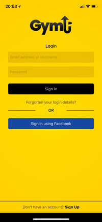
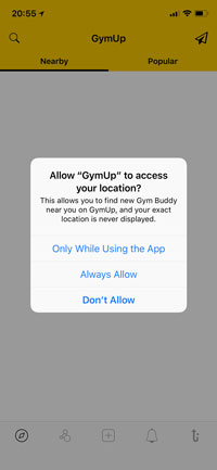
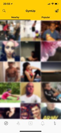
GymUp
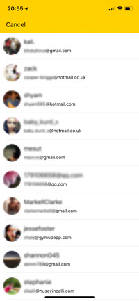
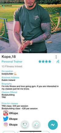
App is fairly sparse, pretty much a grid of user images on load up with no way of filtering based on gym, goals etc. On clicking a user there is nothing there other than a self typed bio and contact details...To me this makes the app seem more like a generic dating app than a purpose built gym buddy finder. Major security issue: the app exposes any members' personal email address. This is a major issue in terms of not only privacy but safety.
FitFLick
App functions like many dating apps with the swipe left/right method of selecting people. Personal trainers are marked via an icon so users know which ones they are, however there is no way of filtering them out and they could be made clearer. You can set your workout preferences on first log in but after that you can't switch; and there is no other method of filtering other than location. There does seem to be a rating system in place, which could indicate a way of telling if people are genuine or not. Overall though, the app is a bit laggy, and a few bugs and hasn't had much of a take up by everyday users.
Bvddy
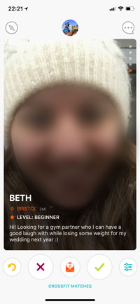
The app has a clean modern look whilst also being fun and friendly. It uses the swipe methodology for saying yes or no to people. Filters include sports and distance, although the list of sports is predefined and somewhat narrow. Users can contact other users without matching as well, although this could be open to abuse. Users can set a small bio, location and level they feel they are currently at in order to help users make the best matches.
Fitmatch
The app has more options and allows the user to set several activities they are interested in, and the level they are in them. However, on the profile view this is shown as a line scale with no context. The user can also set the times of day they work out, which is useful when finding someone to train with. This app uses the grid system of displaying users and does allow for a small amount of filtering. An interesting feature however, is the gym location tab which allows users to search by who is closest to a specific gym. I guess the app designer believes people attend their nearest gym which is quite often not the case. And also they don't have every gym available in the list with some big chains missing.
Survey Results
Based on the surveys conducted the graph below shows the percentages of what the potential users regarded as the most important aspects of the app.
The graph indicates that the areas users thought most important were easy sign up and sign in alongside filterable information regarding another user's goals, local gym - all whilst regarding the users safety and having verified profiles.
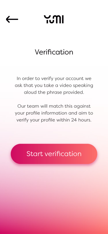
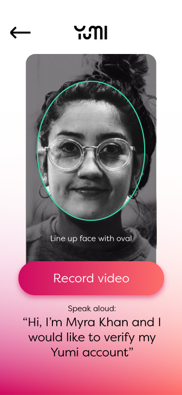
It is likely the emphasis around safety and verified profiles is due to some female gym goers especially feeling that men stalk them, there is certainly enough anecdotal evidence to support this. In some cases this has even lead to women being murdered. With this in mind a key aspect of the app UX will be centered around ensuring the users safety and levels of privacy are maintained. An additional solution will be through verification to ensure profiles are true.
Having a stalker is one of the biggest reasons for people discontinuing their gym presence. Gym Insight - 5 Quirky Personalities You Are Likely to Encounter at the Gym
Another aspect which we asked users about was the method of finding matches. There are 2 main methods that have established themselves within the market; swiping and grid view. We were interested in finding which method the target users found most intuitive.
As the graph shows, swiping is the more intuitive matching method. There is evidence to suggest that the swipe gesture is a recognised and recalled action to users, giving them the power to approve or banish other users with a simple flick. Whilst this app is not a dating or hook up app, some of the functionality can be inspired by their successful user interactions in the forming of a gym friendship app.
Although swiping (a card) was already charged with meanings such as pay, charge, or open, in dating it now takes on the most elemental binary meaning of yes or no. The negating leftward swipe mimics the turning of a page (finished, done). By reinforcing this already coded motion, Tinder has successfully re-signified the swipe gesture to the extent that it is now often first associated with the app and the approval / disapproval binary. G. David & C. Cambre - Screened Intimacies: Tinder and the Swipe Logic
Personas
Monika
Fit-stagram Fanatic
Age 19
Occupation Student
Technical apt. High
Devices Phone, Laptop
Bio
Monika has been at university a few months and has started to gain some weight. She wants to adopt a fitness lifestyle like she sees on instagram but feels unsure how to go about it. She has a gym membership but has only been a couple of times.
Goals
Would like to meet someone who is looking for the same situation
Keep each
other
motivated
Take photos of each other for their instagram fitness accounts
Frustrations
Finding people to go to the gym with
Staying motivated
Creepy guys sending
unsolicited messages on meetup apps
Opportunities
Prevention of unsolicited messages
Goals
Instagram linking?
Gym
search
Gender filter
Justin
Seeking a Spotter
Age 31
Occupation Accountant
Technical apt. High
Devices Phone, Tablet, Laptop
Bio
Justin has been training for a few years, however recently he has hit a plateau and become demotivated due to lack of pushing himself. He trains early in the morning and his partner fears he is pushing himself too hard and without a spotter will cause himself injury.
Goals
Find someone who can push him further
Early workouts
Spotter
Meet
another
man
Frustrations
Not outgoing
Doesn't want a gym 'bro'
Opportunities
State workout schedule
Goals
Make it easy to meet and contact
Gym
search
Gender filter
Abigail
Concerned Changemaker
Age 58
Occupation Nurse
Technical apt. Low - Medium
Devices Phone, Desktop
Bio
Abigail has been told by her doctor that she needs to lose weight. She feels that she would be judged negatively by other gym members and be more confident if she had someone to work out with as she is a sociable person. She has no gym membership yet and is looking at where would be best for her. She is also open to PT sessions.
Goals
Meet someone in similar situation
Find a gym
Meet PT
Meet group
Frustrations
Technologically weak
Doesn't want anyone young
Opportunities
Age filter
Goals
PT search
Group creation
Patrick
Ambitious Personal Trainer
Age 27
Occupation Personal Trainer
Technical apt. Medium - High
Devices Phone, Laptop
Bio
Patrick is a freelance personal trainer looking for new clients. He specialises in weight training and nutrition alongside competition prep. He works at multiple locations and has a busy schedule.
Goals
Advertise his services to the correct people
Gain new clients
Set up group
sessions
Manage bookings
State fees and packages
Frustrations
Confusion over when meeting clients
Clients in wrong areas
Opportunities
PT fee
PT filter
Schedule manager/meetings/events
Activities filters
Functionality strategy
Based on the research conducted we were able to define what functionality the user would like in the app’s main features. In order to deliver a product with a clear message a minimum viable product was sought by categorising the stories into the project scope.
| Features | As a User I want to... | So that I can.... |
|---|---|---|
| Sign up | Sign up using social sign in | Easily create an account |
| Sign up | Sign up using an email address | Sign up without using social media sign ins |
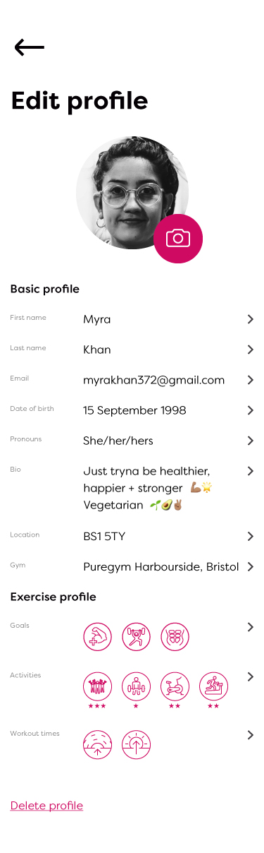
| Basic profile | Add my image to my profile | Show what I look like to other users |
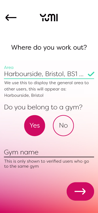
| Basic profile | Add my rough location to my profile | Show other users the areas I train in vaguely |
| Basic profile | Add a bio to my profile | Describe myself |
| Basic profile | State my age | So that I can match with similar ages |
| Basic profile | State my gender | So that I can match with similar genders |
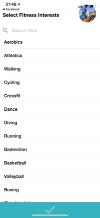
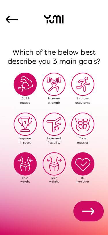
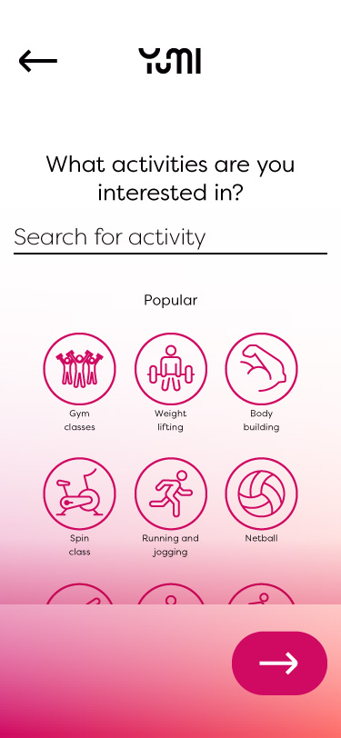
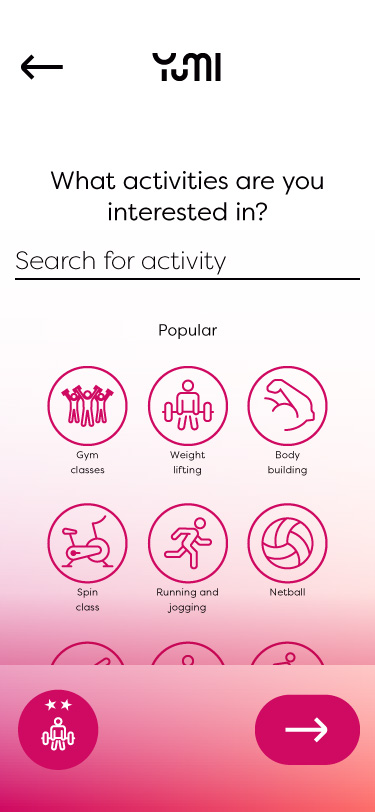
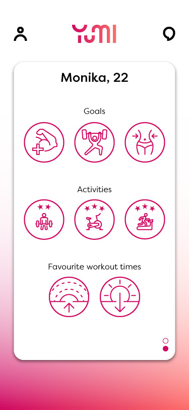
| Advanced profile | Set my types of activities | Find other users which share activities |
| Advanced profile | Add my workout schedule | Find users who workout when I do |
| Advanced profile | Set a specific gym | Find people who already go to the same gym as me |
| Browse/filter | Browse through other users | Find users to match with |
| Browse/filter | Filter other users | Find users which more accurately match with my goals |
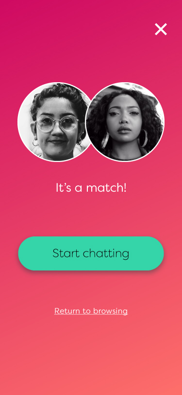
| Match/reject | Match with specific users | Contact them about becoming gym buddies |
| Match/reject | Reject users that aren't suitable | Not be contacted by them |
| Block user | Block users who I don't want to be contacted by | Not be contacted by them further |
| View profiles | Read a users profile | See if they would be a suitable match |
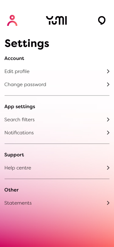
| Settings | Have the ability to change my notification settings | Have options on how the app notifies me |
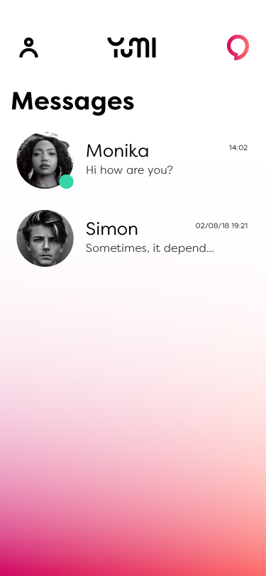
| Messaging | Send a matched user a message | See if I have repoire and then arrange a meet |
| Personal trainer | Create a personal trainer profile | Look for new clients |
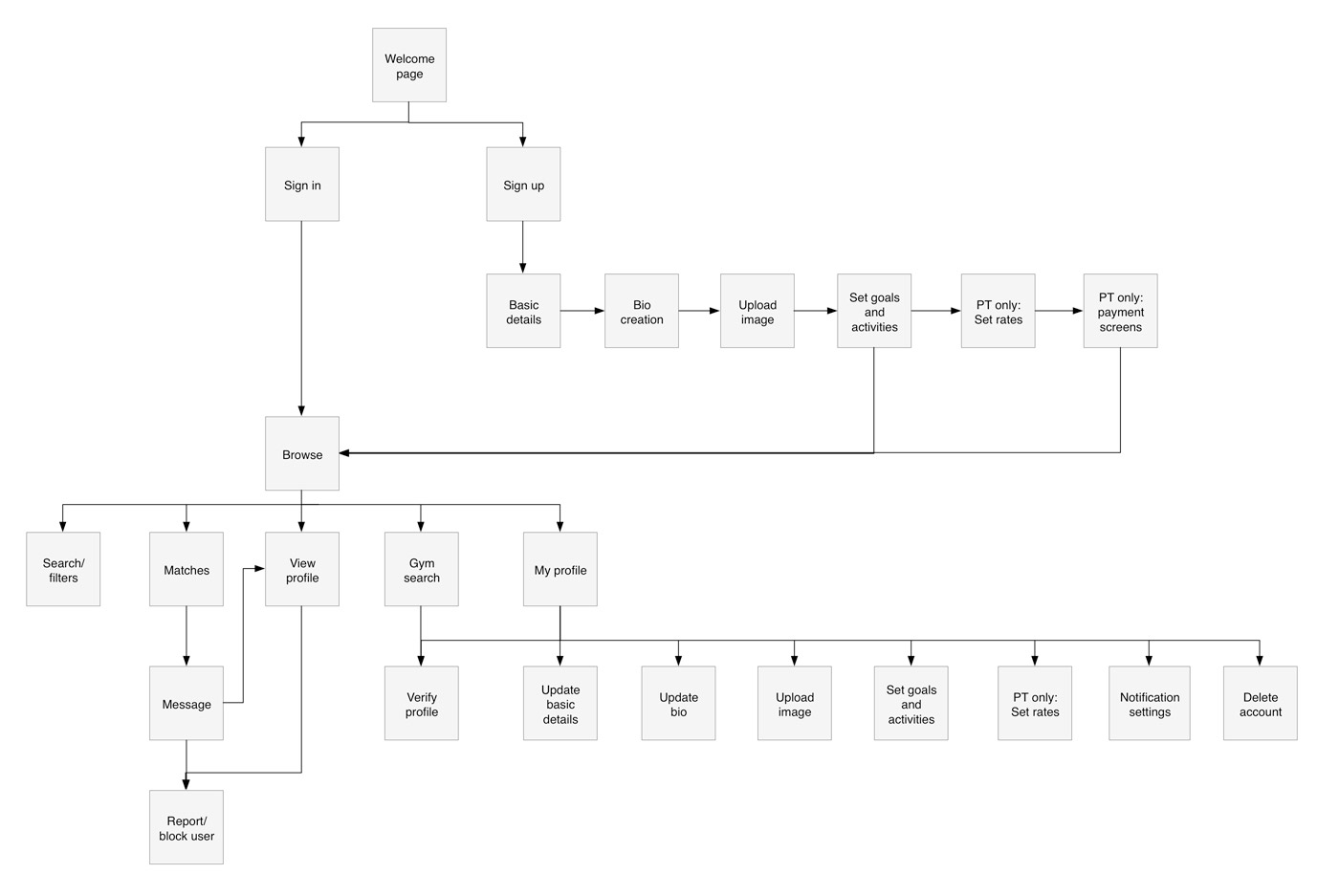
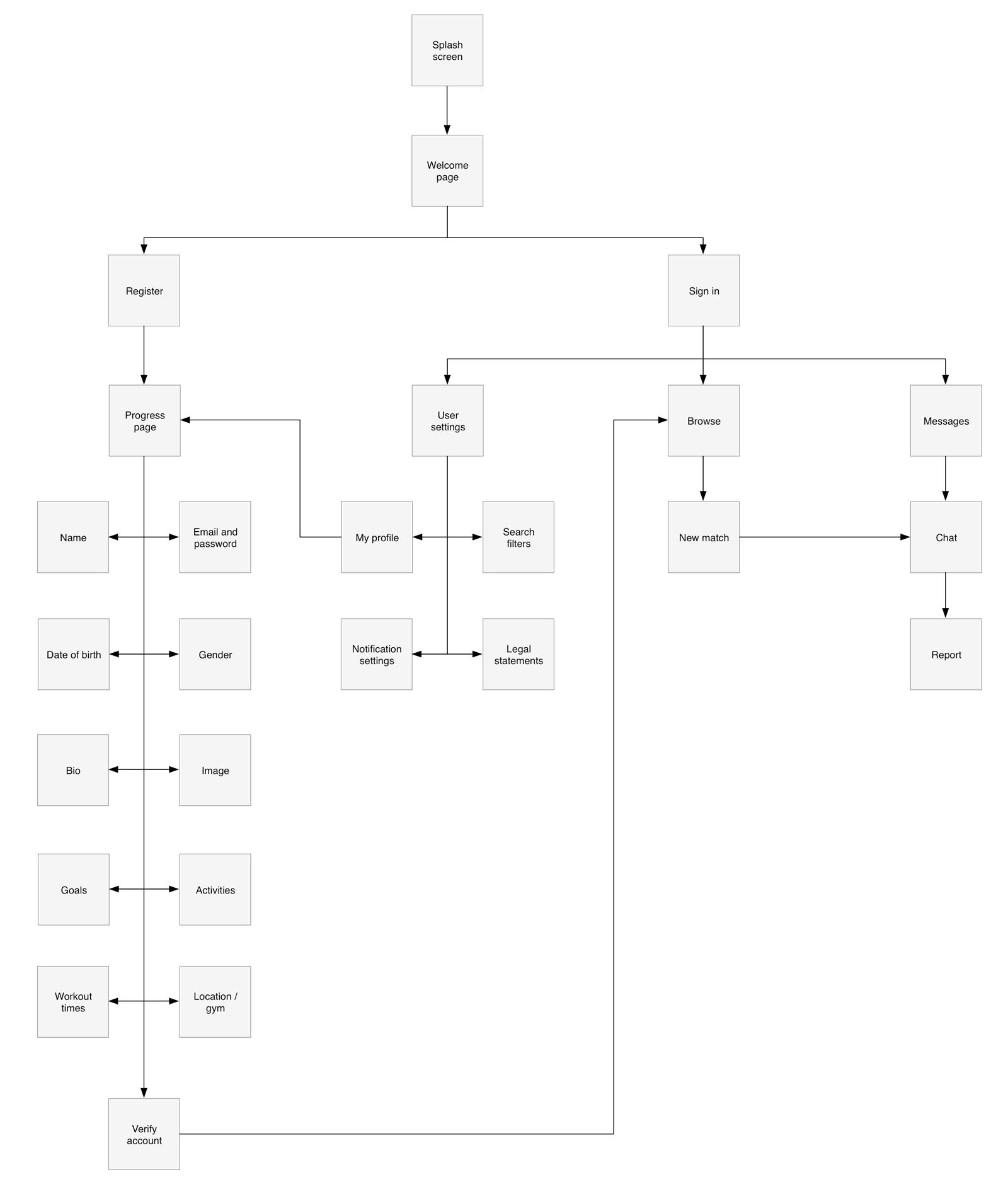
Sitemap
Sketching & wireframing
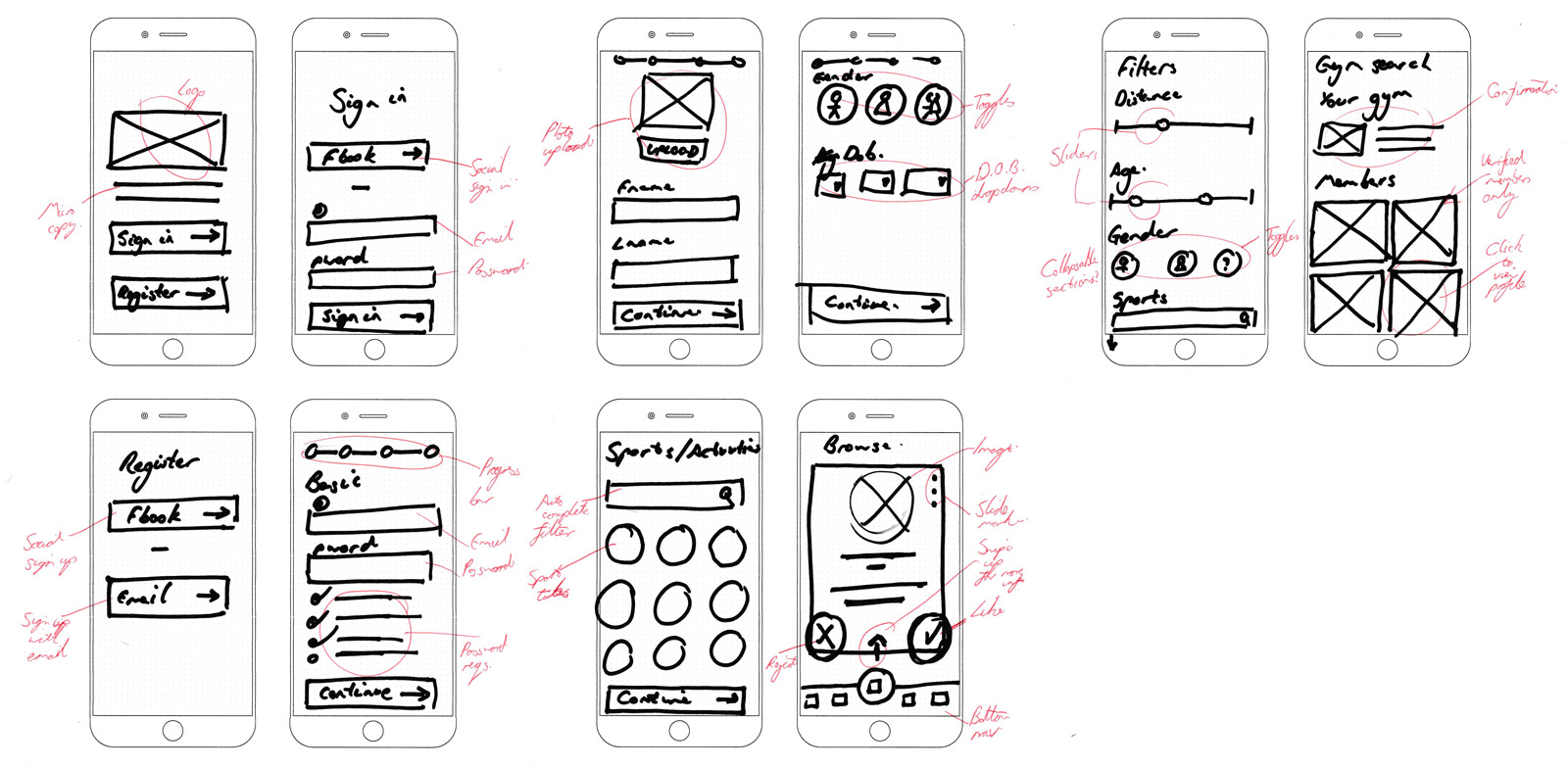
Low fidelity prototype
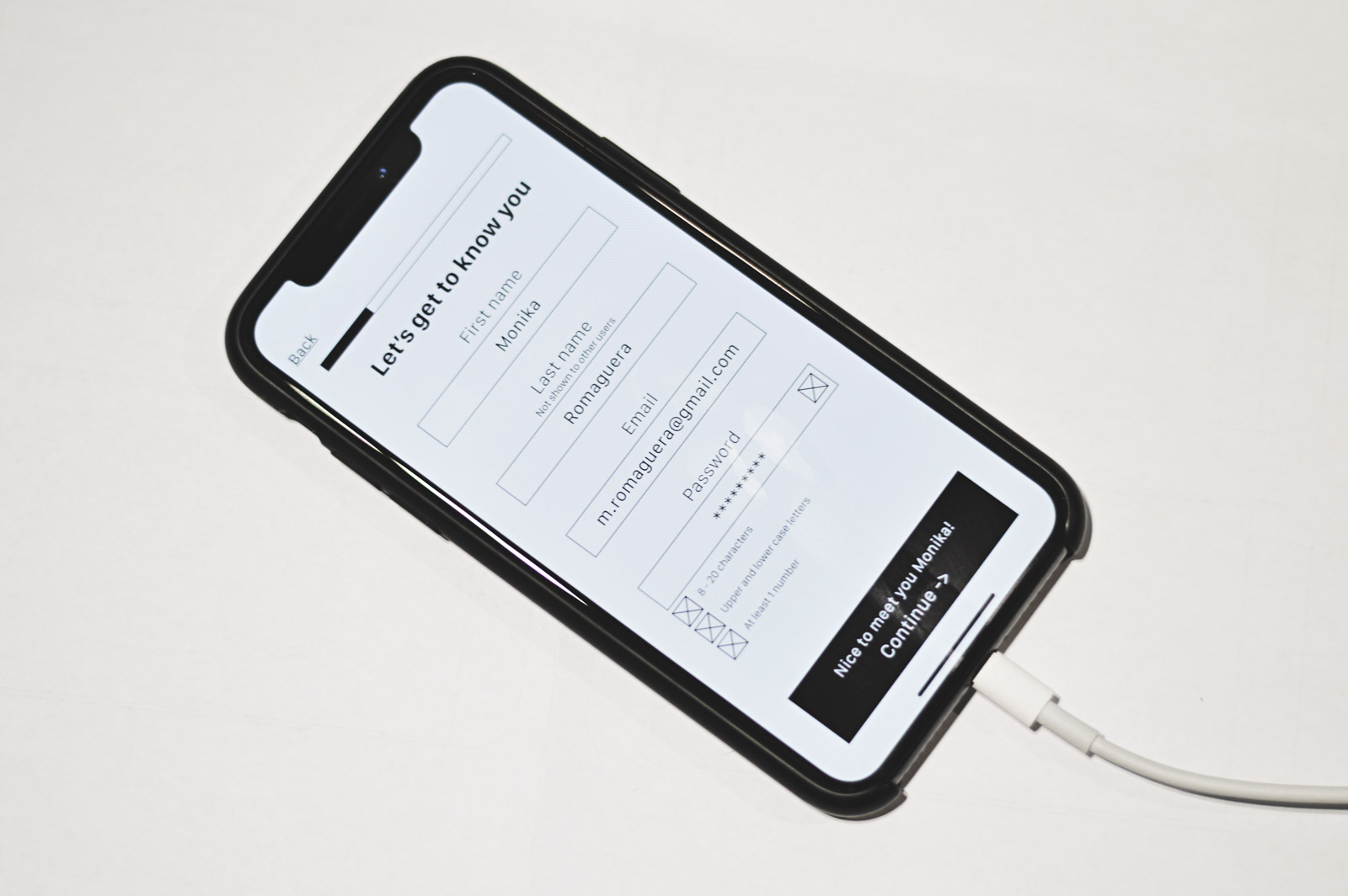
After the initial sketches I proceeded to implement a low fidelity prototype in Adobe XD. I kept colour scheme neutral for this point so as not to detract from the usability testing. Although the branding and tone of voice hadn't been decided at this point the initial low fidelity prototypes used a friendly, casual language as we felt this was the correct direction initially.
This prototype was clickable along main user journey routes with the intention of testing with users. We chose to ignore the personal trainer section at this point for MVP.
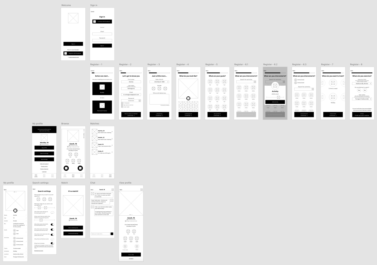
User testing
Guerilla testing was ran on an iPhone device allowing for a more realistic interaction scenario. We were looking at an pain points that the user came across, any suggestions they could make about the flow or options available.
Based on several users responses the major issues with the current setup are:
- Allowing any type of photo to be uploaded could lead to misrepresentation and fake accounts.
- Breaking the registration flow down in more steps but simpler forms elements would make the form flow quicker in more bite sized chunks.
- Onboarding explaining some of the benefits and basic use of the app.
- Removing the number of times someone trains a week as a criteria as it may prevent matches which could potentially encourage users to go to the gym more.
Future iterations of the design would include these ideas. However, since several of what is shown on these screens will be dictated by the branding and tone of voice this stage was considered next.
Branding
During our initial competitor evaluations we discovered that the original name - GymBuddy - that was chosen was being used by another app of a similar nature, albeit not currently available. As such we investigated other brand names in order to start our visual design production.
We started by developing a range of different names centered around the theme of the app including portmanteau and abstract links. Once we had this list we tested the names with users to discover the most understandable - in terms of app goal - and memorable - measuring ability to recall exact name. We also wanted the branding to be fresh and modern so enquired around these factors as well.
Based on the results it was a close running between Burn and Cohort, with Cohort being the preferred choice due to Burn's many uses with a range of products already.
Another aspect of this brand testing was to find out more about the user base and focus our target audience more; to this end taking the previous personas into mind we tried to determine the demographics of the users who would be more likely to actively interact with the app.
Our findings found that people who identify as female or other were more likely to positively engage with the app; especially those in the age ranges of 14-35 and 55-65+. As such the branding would be more focused on these demographics.
Logo development
The ideas which stood out most were the calligraphic and modern geometric styles that had a more modern feel. I explored these logo avenues - creating both a calligraphic and geometric version for selection by the client.
The client felt that the geometric style was the best match for their brand and as such I produced the final version.
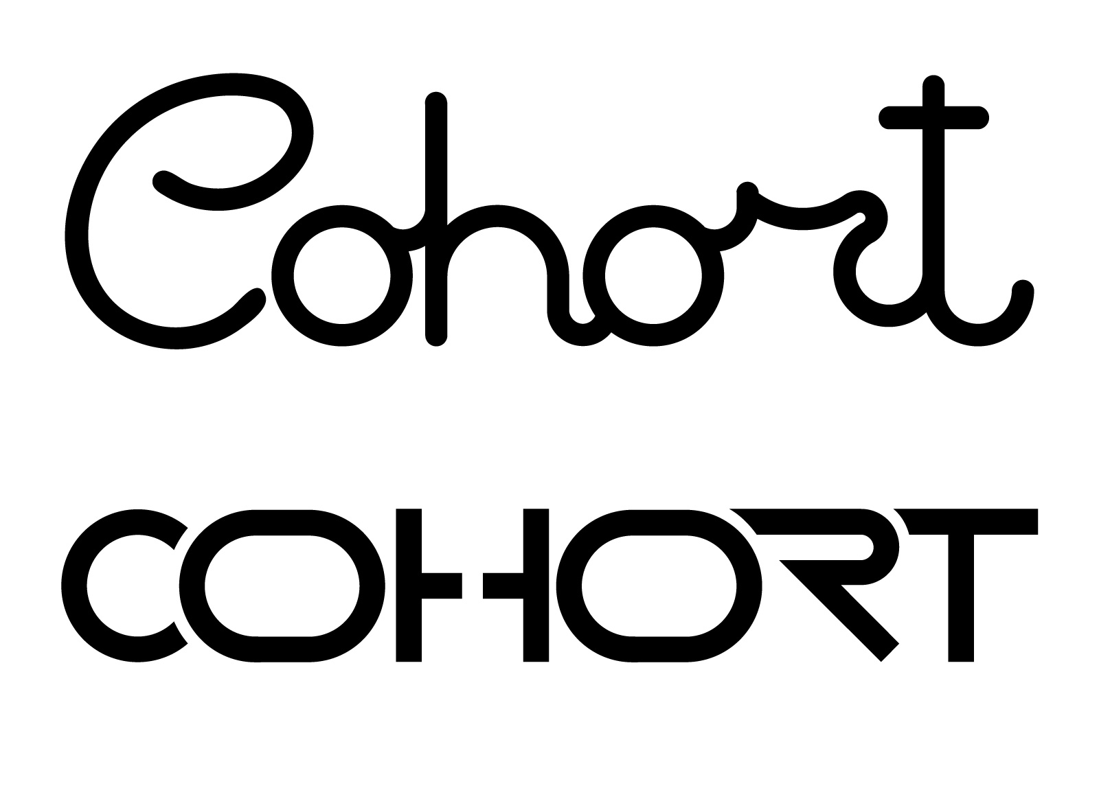
After a secondary round of testing with branding, the brand name didn't favour very well and as such we went back to branding to decide upon a more reflective brand name. The final idea was YUMI. The name not only is a portmanteau of 'You' and 'Me', but is also a female name meaning friend. We felt like this really summed up the ethos of the app and tested far better than any of the previous options.
Brand colours
We wanted to keep the colour palette in a similar fashion to the logo: fresh and modern, slightly feminine - without being cliché - and minimalist. As such we built upon a simple black and white palette with complimenting bright colours. These would then be used to accent elements, and in gradients to add visual appeal.
Raspberry
Blush
Verdant
White
Pale grey
Warm black

Font choice
For the typography within the app we wanted to use a font family that shared the roundness of the logo. Round fonts also give the user of friendliness which was an important aspect of the apps ethos. As such, we chose the font family "Filson".

Component design
The first step in building a component library was to determine the elemental components the app would require. These were:
- Tab bar
- Buttons
- Text input
- Date selectors
- Yes / no selectors
- Gender selectors
- Workout time selector
- Value sliders
- Toggle switches
- Progress indicator
- User images
- Swipe buttons / elements
- Messaging controls
Final components
Tab bar
This was placed along the top of the screen so as not to interfere with the users
usual range of thumb motion during the swiping action.
Transitions will function
in a side push method and the tab will respond in a fluid, organic animation.


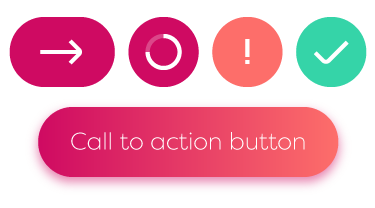
Buttons
There will be 2 main types of buttons used within the app, calls to action and progression buttons. The progression button animates to show if there are errors or confirms a positive and moves the user along their journey.
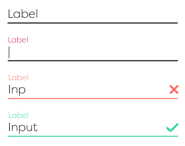
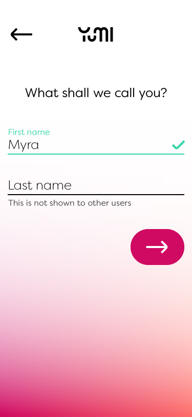
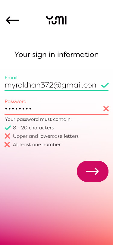
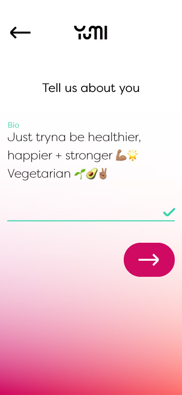
Text input
Text inputs will be kept fairly simple using a floating label, and providing feedback inline.
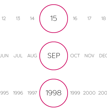
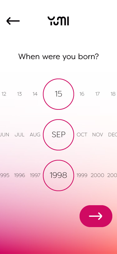
Date selectors
Within the app there is only 1 instance of a date selector and that is for date of birth selection. It was decided to go with a slightly different interaction than the standard iOS dte picker.
Yes / no selectors
A simple yes no selector in the style of modern radio buttons. By default they would be unselected to encourage the user to make the correct decision.

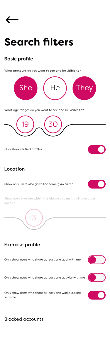
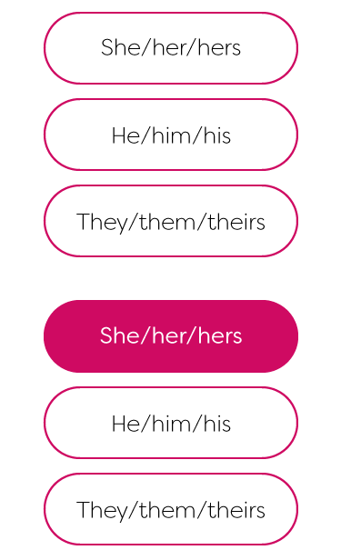
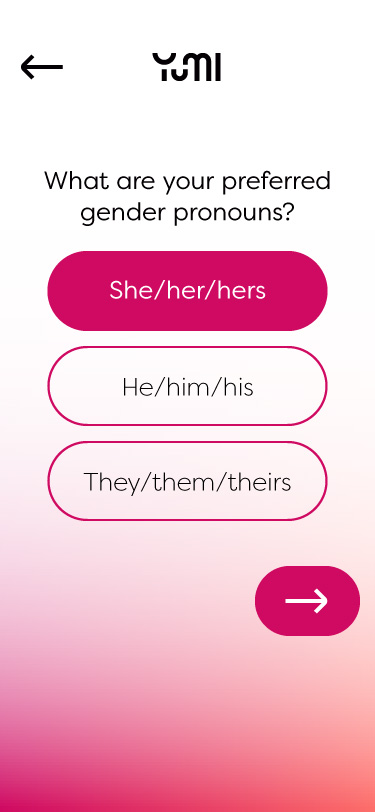
Gender selectors
This was a difficult element to design as the aim of the app was to be as inclusive
as possible and therefore we had to find a way to allow for users who do not fall
within the male / female genders, without also forcing them into a selector they
feel doesn't represent them. This is especially important as a portion of the
intended audience is Gen Z and based off of a report by J. Walter Thompson Innovation
Group, "They see gender, sexuality and their own general identity as fluid
or different from what was assigned at birth, while the world they interact with
often forces them to 'make a decision'"; this is something we wished to avoid.
This would also be used in filter functionality so couldn't be bulky.
In the end
due to the large number of recognised genders, we decided to break it down into
asking the user their preferred pronouns, thus making an easier to interact with
element.
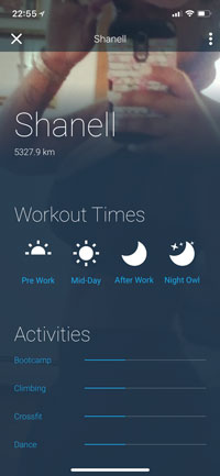
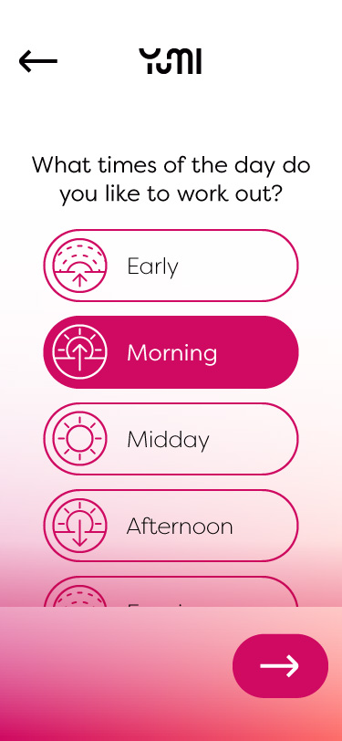
Workout time selector
In order to keep the selections filterable it was decided to split the day up into
preselected sections rather than allowing users to set their own hour based
times.
This was down in a similar way to the yes/no selectors but using
iconography and labels to make it more interactive.

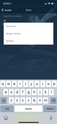
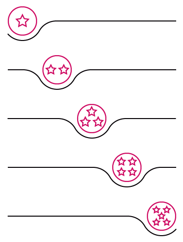
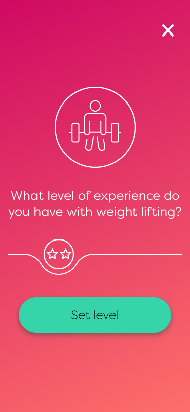
Value sliders
The value slider is used to set the users competency in activities. The icon will change based on the current position.
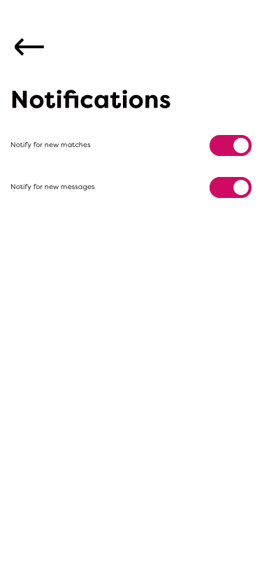
Toggle switches
This will be used in the settings menu to toggle notification settings, options etc on and off.

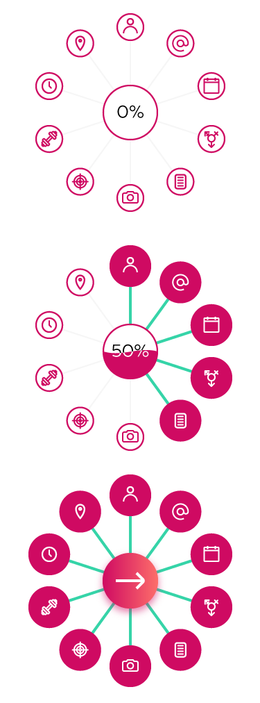
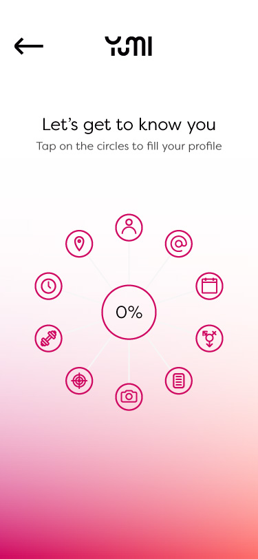
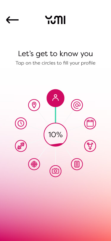
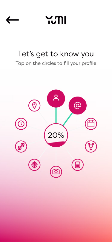
Progress indicator
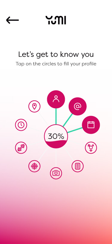
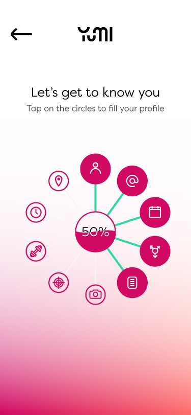
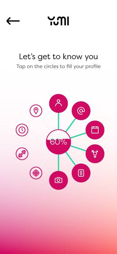
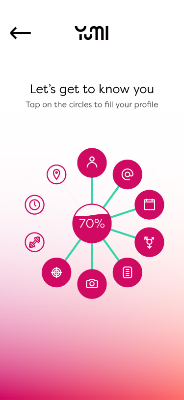
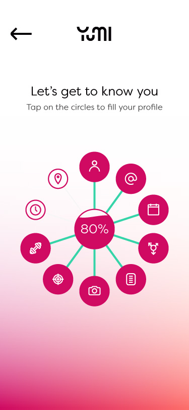
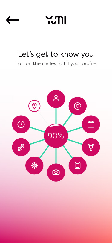
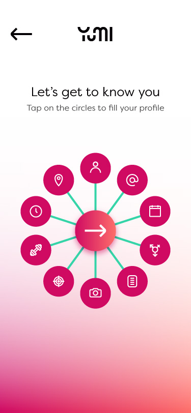
Instead of going down the route of a linear progress flow, it was decided to go down the route of a wheel like interface element where the user can choose the order filling in the form. As elements are completed in the lines towards the centre fill until completed. Once complete the user can move on to the rest of the app.
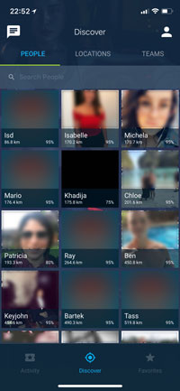
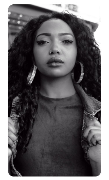
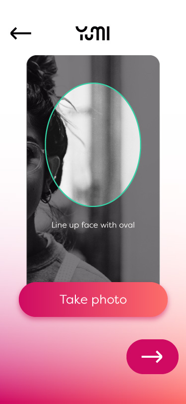
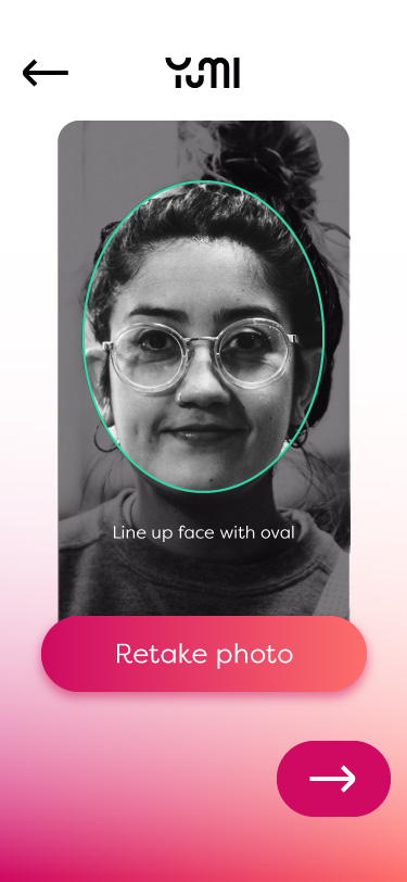
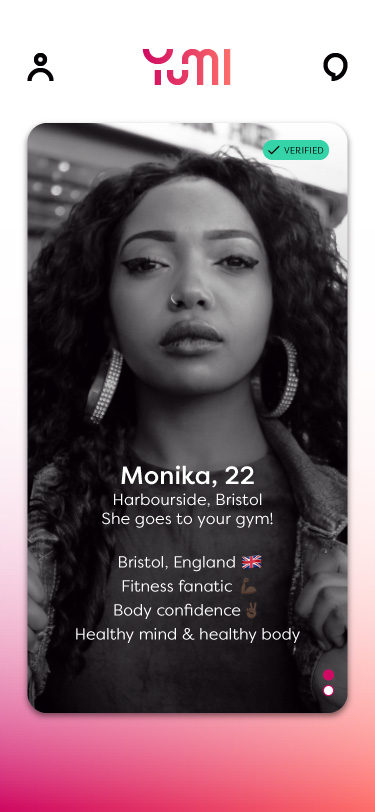
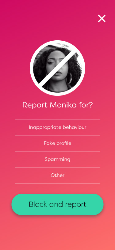
User images
In order to ensure a consistent look and feel through the app users are asked to upload simple head shots. Not only would this help with verification, it prevents users from uploading misleading photos or creating fake profiles. Images are turned into black and white automatically to prevent overload of colour on the users browsing view.
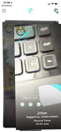
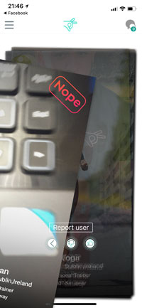
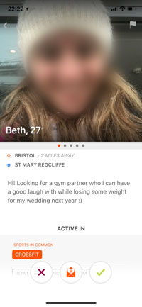
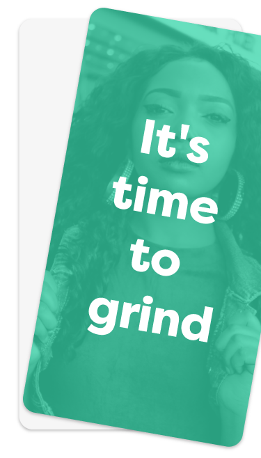
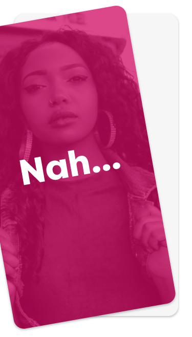
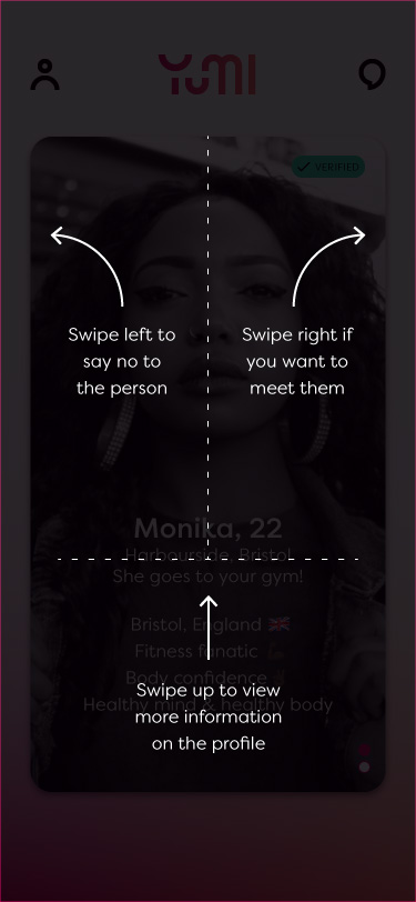
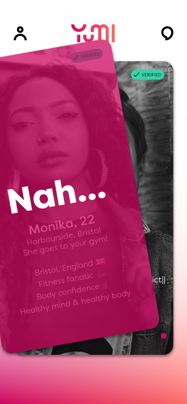
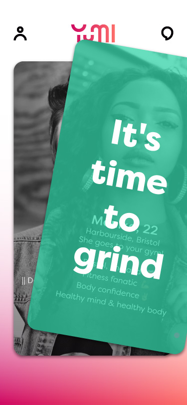
Swipe buttons / elements
A main element of the user interaction in the app is the swiping to match with
users. As this is not a dating app we wanted to avoid the iconography usually
associated with it to keep it more fitness buddy and less 'do I want to date this
person'.
In order to do this we went with changing text overlays – negative
being variations of 'No' such as 'Nah...' and 'Nope!'; positive swipes being
variations of positive fitness type messages, for example 'It's time to grind' and
'Beast mode on!'.
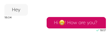
Messaging controls
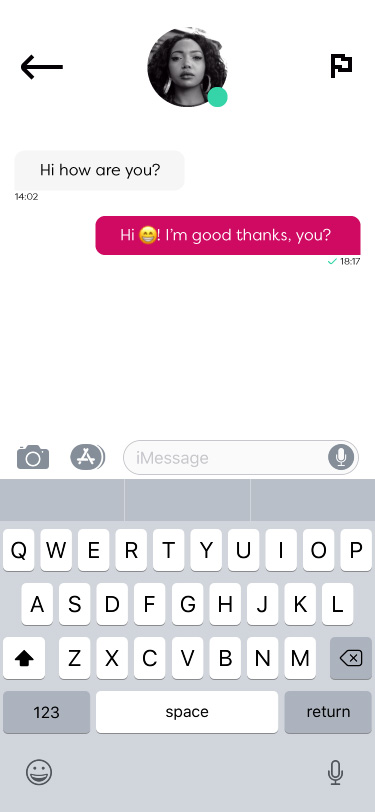
The messaging aspects were kept as native as possible utilising the existing keyboards and message display methods.
Final sitemap
After developing the components for the progress page it became obvious that the existing sitemap was outdated. As such a new one was mapped out.
Final designs
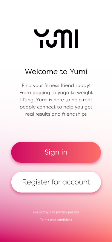
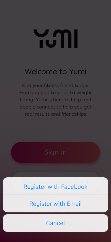
Splash and welcome screens

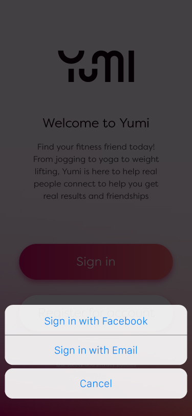
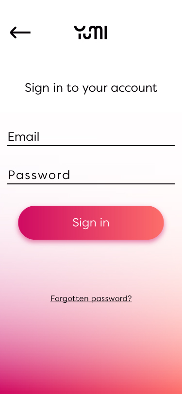
Sign in screens
Register - progress

Registration screens
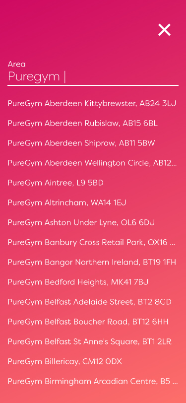
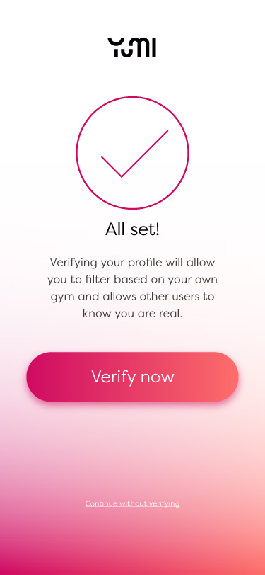
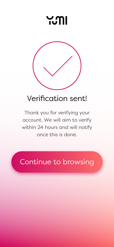
Verification screens
Browsing screens
Messaging screens
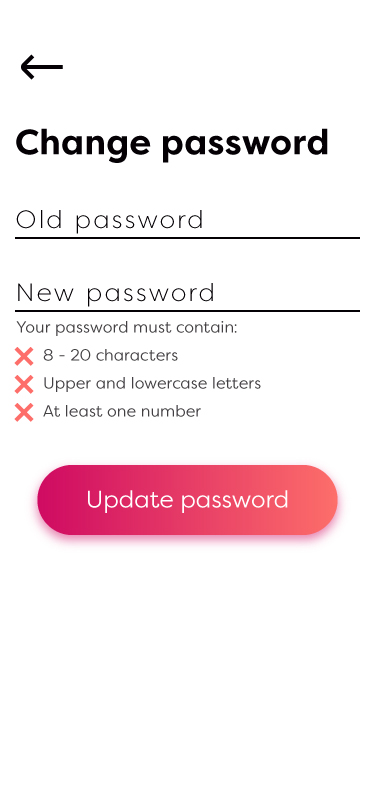
Settings screens